Wall colours for your home: how to choose (and combine) them without mistakes
How to choose wall colours for your home: light and orientation, proportions, colour combinations and samples, with an architect's real palettes.
By Martina Pozzi, architect in Bergamo
Choosing wall colours for your home takes five steps: look at the light in the room, consider its proportions, decide the balance between colours, test a large sample and judge it next to the floor and furniture. The fear of getting it wrong almost always comes from skipping the last step and choosing from a fan deck in a shop.
In this guide I explain the method I use on my projects, with palettes from real homes. If you're interested in the why before the how, I've written an article on colour as a design tool.
How to choose wall colours: start from the light
The same colour changes a lot depending on which way a room faces:
| Orientation | What the light is like | What works |
|---|---|---|
| North | Cool and steady | Warm, light tones: ivory, sand, dusty pink. Avoid cool greys |
| South | Warm and strong | You can go darker or cooler: greens, blues, greys |
| East | Warm in the morning, cool in the evening | Colours that cope with the change: warm neutrals, soft greens |
| West | Cool in the morning, warm and golden in the evening | Fresh tones that warm up in the evening: dusty blues, sage |
Artificial light matters too: a warm bulb (2,700–3,000 K) warms and yellows a colour; a cooler one (4,000 K) cools it. Test the colour with the lights you'll actually use.
Room size and proportions
- In a small or dark room, a light, warm colour opens it up and brightens it; but a dark colour on every wall can also make it cosy and enveloping, if that's the intention.
- A high ceiling comes down with a colour darker than the walls, or with a band of colour dropping 30–40 cm from the ceiling.
- A long corridor feels shorter if you paint the end wall.
- A low ceiling feels higher if you carry the walls' light colour onto it.
Combining colours: the 60-30-10 rule (and when to break it)
The 60-30-10 rule says a room feels balanced when about 60% is a dominant colour (usually the walls), 30% a secondary colour (floor, large furniture, textiles) and 10% an accent colour (objects, one wall, a detail).
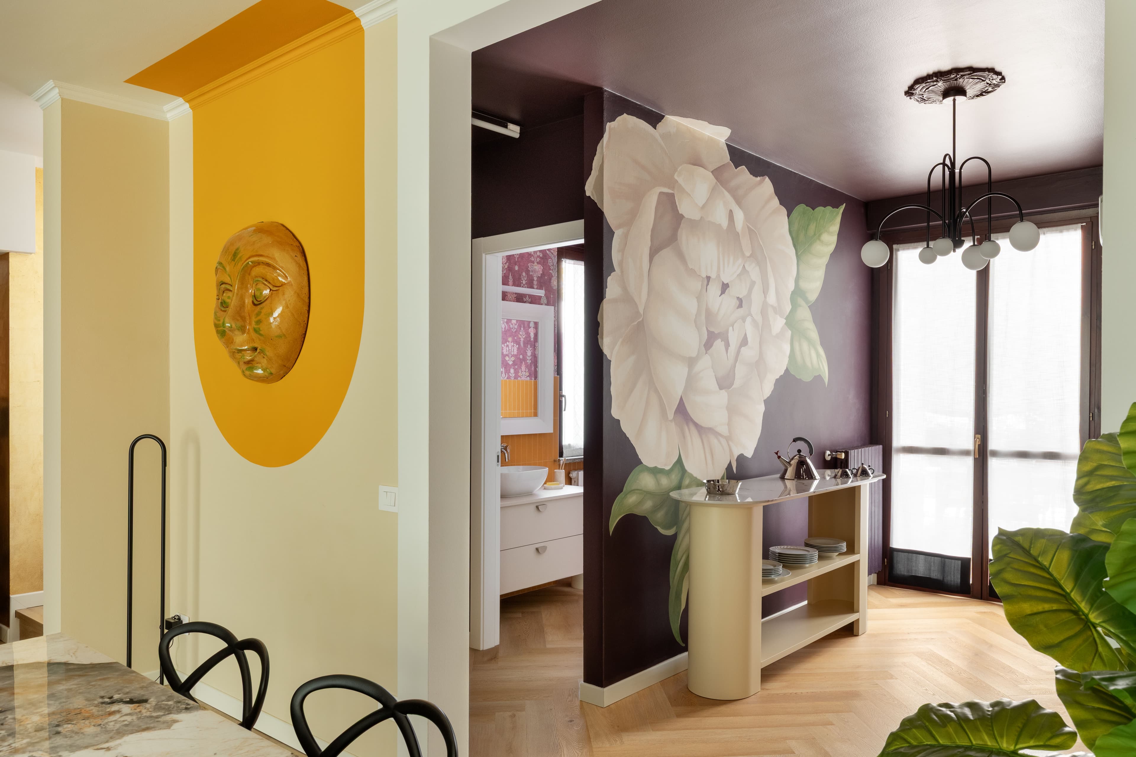
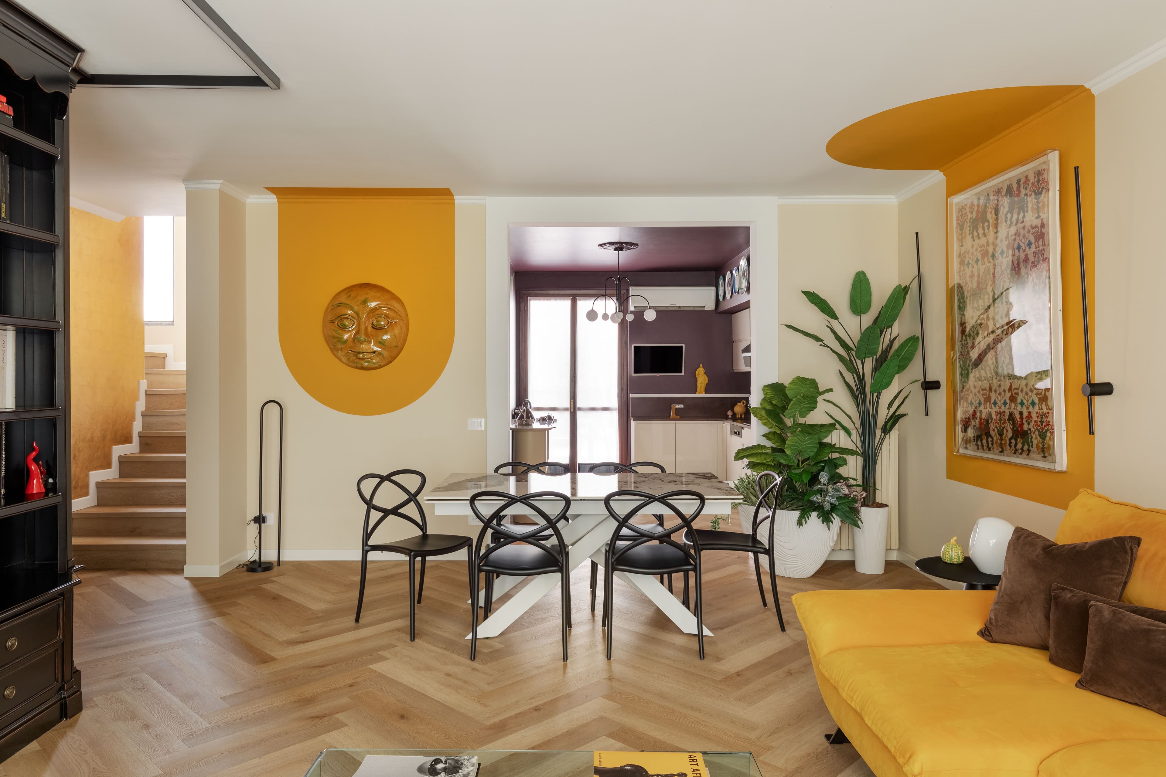
At CASA PEONIA the living area works exactly like this:
- 60%: the pale ivory walls, which replaced electric blue and brighten the whole floor;
- 30%: the light oak floor and the near-black brown of the entrance wall, which turns into the living room;
- 10%: the gold yellow of the velvet sofa and of the semicircles painted on the wall.
The rule is a starting point, not an obligation. In a room you want to feel enveloping, like the blue ITALIAN SUMMER bathroom, one colour can reach 80%. For combinations there are two safe routes: analogous colours (close on the colour wheel, like green and blue) for a calm effect, and complementary colours (opposites, like blue and orange) for a lively one, using the second only as an accent.
Walls, ceilings and half walls
Colour doesn't have to cover a whole wall:
- half walls: in the PARIGINA Kitchen the floor tiles run up the walls to half height, protecting them and shaping the room;
- painted shapes: at CASA PEONIA, gold-yellow semicircles frame a Sardinian rug and a ceramic sun, like a backdrop for the objects in the home;
- colour that turns the corner: a coloured wall that carries on round the corner links two spaces;
- coloured ceilings: in a bedroom, a painted ceiling makes the space feel more enclosed.
How to test a sample (properly)
A small sample tells you almost nothing. To test it properly:
- paint a large sample, at least 50×50 cm, or a piece of card you can move around;
- apply two coats, as on the real wall, and wait for it to dry: wet paint looks darker;
- try it on two different walls, one in light and one in shade;
- look at it in the morning, the afternoon and the evening under artificial light;
- judge it next to the floor, furniture and fabrics that are staying.
Room by room
| Room | One idea | From my projects |
|---|---|---|
| Living room | A warm colour that draws the room together | The terracotta living room at LOVINGCOLORS, inspired by a church in Seville |
| Bedroom | Calm, dusty tones, on the ceiling too | The powder blue of the master suite at Casa Archi & Colori, with midnight blue behind the bed |
| Kitchen | Colour on a single element: doors, splashback or one wall | The grey-blue kitchen at LOVINGCOLORS |
| Bathroom | A colour that wraps the room, or a calm base with an accent | The blue of ITALIAN SUMMER; the powder blue and orange of the CASA ARCHI & COLORI Bathroom |
| Children's rooms | Pastels and patterns, leaving room to grow | The pastel tones with lace-like decoration in the girls' rooms at Casa Archi & Colori |
The guides on how to design a bathroom and a kitchen go further into colour in those rooms.
If you're renting
In Italy, tenants must return a home in the condition they received it, apart from normal wear and tear (art. 1590 of the Italian Civil Code). So before painting:
- ask the landlord's permission, ideally in writing;
- choose colours that are easy to cover if you'll need to repaint at the end;
- or bring in colour with things you can take with you: removable wallpaper, curtains, cushions, pictures and a rug that changes a whole room.
The most common mistakes
- Choosing from the fan deck in the shop, under light that isn't your home's.
- Ignoring the floor: warm parquet or a grey floor changes every colour next to it.
- Too many different colours with no dominant one.
- All white "to be safe": white isn't neutral and, used everywhere, it flattens rooms. I explain why in the article on colour in interior architecture.
- Deciding the colour last, when furniture and floors are already chosen and there's little room left to manoeuvre.
Want to choose your home's palette with an architect? In a 60-minute consultation we choose it together; if you want to change the look of your home without major works, you can see how I work on the restyling page.