Colour in Interior Architecture: Tool, Not Decoration
Colour is often treated as a secondary element, to be decided once the work is done. I see it differently: colour is structure, light, emotion.
By Martina Pozzi, architect in Bergamo · Updated 10 October 2026
How many times have I heard, mid-project: "we'll sort out the colours at the end"?
Colour in interior architecture is not an accessory you add once everything else is in place. It is one of the founding elements of a project — just as much as the layout of spaces or the choice of materials.
A wall painted blue is not simply a blue wall. It is a wall that makes a room feel smaller or larger, that absorbs or reflects light, that creates tension or ease, that says something about the people who live there.
In this article I explain how I use colour in my projects: how it changes with light, how it alters proportions, why white is never neutral and how I decide on it together with clients, using four real homes.
Colour, light and material
The same colour is never the same in two rooms. It changes with:
- orientation: north light is cool and steady, south light is warm and shifts a lot through the day. A blue-grey that looks bright facing south can turn gloomy facing north;
- time of day: morning, afternoon and evening under artificial light show three different colours;
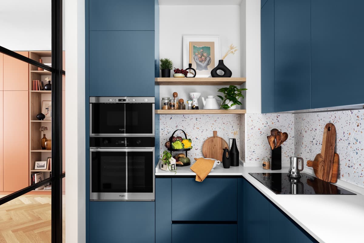
- finish: matt paint absorbs light and softens a colour; gloss lacquer reflects it and makes it vibrate. In the MITE Kitchen, the mink lacquered doors change tone with the time of day.
That's why you don't choose a colour from a fan deck under shop lighting, but in the room it's going into, looking at it at different times.
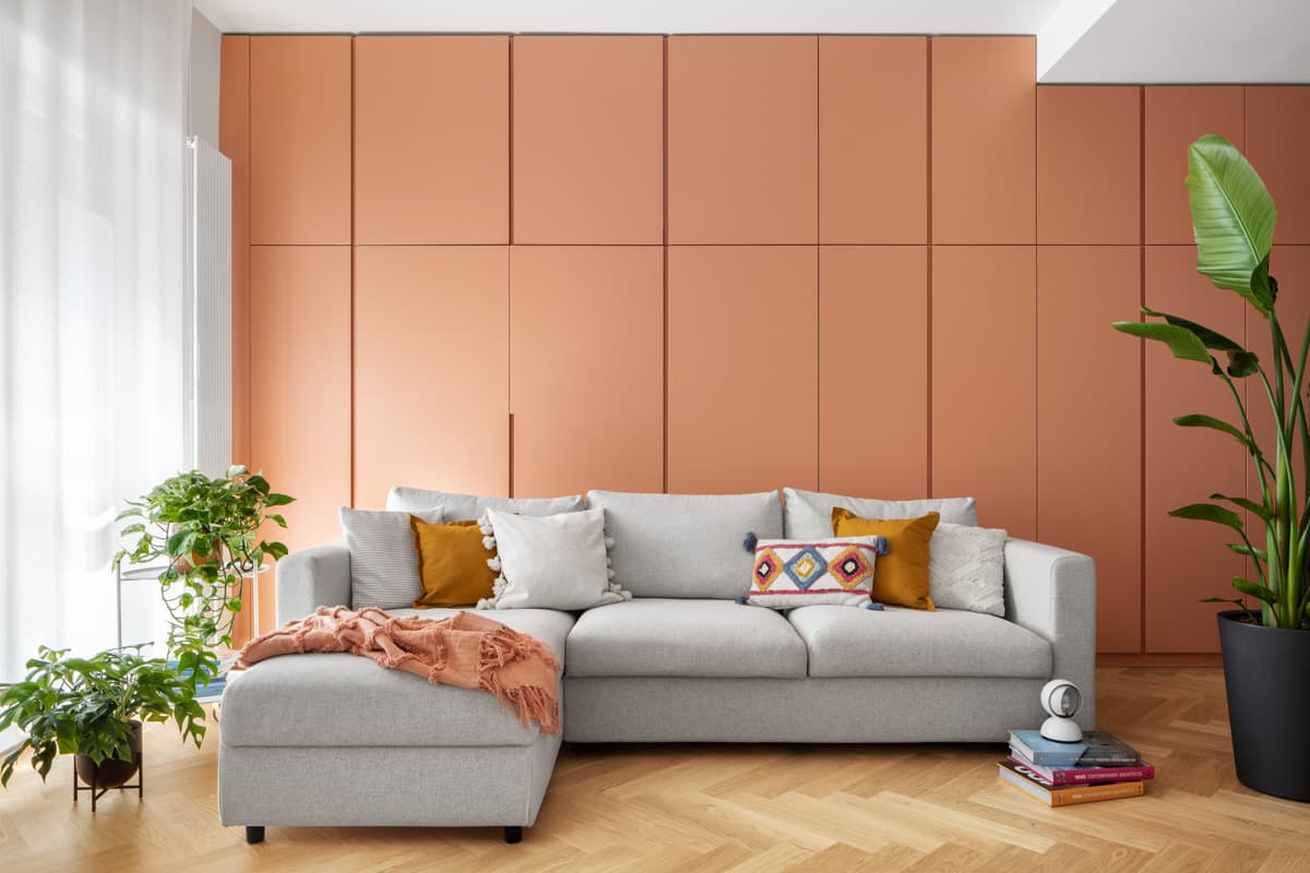
In the LOVINGCOLORS project we built colour palettes from the natural light in each room, the orientation of the flat, and above all the personality of our clients. The result is a space that breathes, that moves you, that is unmistakably theirs.
Colour changes proportions
With colour you can correct a room without moving a wall:
- light colours push walls back and open up the space; dark colours draw them in and make it cosier;
- warm tones seem to come towards you, cool tones recede;
- a ceiling darker than the walls lowers it and makes the room more intimate; the same colour running from the walls onto the ceiling, by contrast, erases the edge and lifts the space;
- a coloured end wall in a long corridor shortens it; a low band of colour makes it feel wider.
Le Corbusier, with his colour keyboards for Salubra, was already describing colour in 1931 as a tool able to change space. That's how I use it too: to design with colour, before choosing it you need to know what it has to do to the room.
The problem with white
"Let's do everything white, so it's neutral." But white isn't neutral: there are warm whites, with a yellow or pink base, and cool whites, with a blue or grey base. A cool white in a north-facing room can make it grey and flat; a warm white in a very sunny room can drift towards yellow.
White has another limit: used everywhere, it flattens. Rooms lose depth, and the objects you care about have no background to set them off. Often an ivory or a barely tinted tone makes a home look brighter than optical white.
Continuity between rooms
A colourful home is not a home with a different colour in every room. Colour works when it ties spaces together:
- at Casa Archi & Colori, in Milan, the same green shapes the living-room bookcase and the wall of cupboards hiding the home office opposite, while the corridor stays white and acts as a pause between the colourful rooms;
- at CASA PEONIA, in Camparada, the gold yellow of the sofa returns in the ground-floor bathroom, which in turn echoes the plum of the kitchen and the pattern of the Sardinian rug in the dining room. Upstairs, semicircular strokes of blue paint lead along the corridor to the bedroom.
So, moving from one room to the next, you feel you're in one home, not in a collection of rooms.
How I work with colour on a project
Colour comes into the project from the start, not at the end:
- Listening: before colours come people. I ask what they love, where they have lived, which places make them feel good, which objects they want to show off.
- LOOKS & FEELS: a board of concrete references and emotional inspiration that sets the style of the project. It's when the client reacts to images and we work out together what moves them.
- MATERIALS MOODBOARD: colours and materials side by side, as they will sit in the home: floors, paints, woods, fabrics, tiles.
- Checking in the room: the chosen colours are looked at in the real home, in its own light, before the final decision.
The big decisions are made on the moodboard, while changing them still costs little.
Four projects, four palettes
| Project | Palette | Where it comes from |
|---|---|---|
| LOVINGCOLORS, Bergamo | Terracotta, grey-blue, green, yellow, pastels | The owners' years in Spain: a church in Seville for the living room, sea glass collected in Barcelona for the kitchen, the Seville Fair for the child's room |
| Casa Archi & Colori, Milan | Green, powder blue, midnight blue, pastels, yellow and orange accents | One colour for each area of the home, with a white corridor as a pause |
| CASA PEONIA, Camparada | Pale ivory, near-black brown, gold yellow, plum, blue | Bringing out design furniture and artworks with coloured backdrops and painted semicircles |
| CASA ARCHI & COLORI Bathroom | Powder blue and orange | A calm base to relax and a vitamin-rich accent to start the day |
Casa Archi & Colori was featured in HOME magazine and on the Homeadore blog; LOVINGCOLORS in Cose di Casa and on Homeadore.
That is the power of colour used with intention: not to beautify a space, but to define it.
If you'd like to bring colour into your home, you can start with a 60-minute consultation or a colourful restyling. For the practical side, I've written a guide on how to choose wall colours, and about using colour in the bathroom and the kitchen.